Romantic Entry Before & After

One of the last areas of our home to get the romantic treatment was the front entry hall. Again, I wanted to use what we had, create some warmth and texture – both inside and outside as you approach our front door – add privacy to the side-light windows and make the area more usable. Of course, I will work mostly with items we already have.

Here’s a before picture.
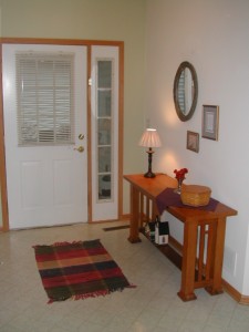
Photo R. Meshar

OK, but needs some freshening up.

The blinds work well and will stay. But curtains or sheers for the sidelights are expensive. Window film at Home Depot was less than $20. It cuts to size, adheres with soapy water (low-tech) and comes in many patterns. This leaf pattern looks good, provides privacy and lets the light in.

I replaced 60 watt bulbs with 75 watt bulbs in the light fixture. This brightened the area overall at minimal cost.

The sofa table was given to a friend and the armoire was placed in the entry area. I have learned that large pieces of furniture can successfully go in small spaces. It works here. The mirror on the armoire door bounces light around this darker area. A bright shawl and pottery highlight the dark wood.

Next I replaced the worn rag rug with a silk oriental rug we already had to complement the armoire. A hook rack (purchased on Craigslist, $5) for guests’ coats and jackets was hung on the opposite wall.

That’s it. Total cost less than $25. Here’s the after.
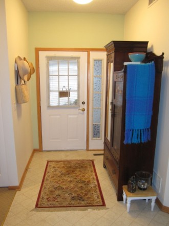
Photo A. Meshar

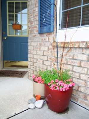
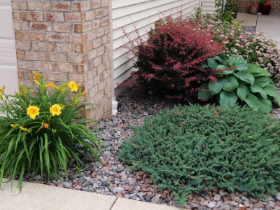
Outside, a small basket with bright children’s garden tools was hung on the door. I placed a bright, red pot near the entry to contrast against the light brick. This area gets little sun so plants here must appear bright even in the shade. Mint, impatiens and lavender add scent, color and various heights. It smells great as you walk by and it looks colorful, even at night. Sometimes luminaria (votive lights) in white bags light this outside walk-way for guests. It looks inviting, especially sitting on top of the snow in winter.
The back door, office and laundry area are next on my list . . . stay tuned.

You may also like Romantic Living Room Before & After, Romantic Bathroom Before & After, Romantic Kitchen Before & After.
Romantic Kitchen Before & After

You may remember that I decided to give the romantic treatment to my kitchen this year (check out Romantic Kitchen Inspiration post) – just as I did with other areas of our home here, here, here and here.

This was my inspiration:

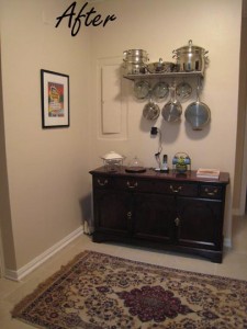
Photo Apt. Therapy Butlers Pantry After

My hope was to add a little sparkle, better lighting, make things we use often more accessible (not having to constantly get cookware from the bottom cupboards for example), make use of wasted space and update the look.

As with other areas in our home, I am not spending money to change out perfectly good counters, sink or cabinets just because they are 10 years old and don’t match styles in new construction. Likewise, our appliances don’t match but they work and so are staying, as is the flooring.

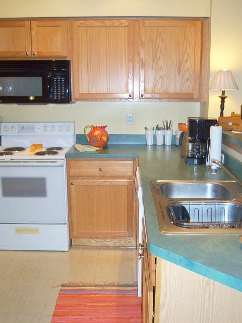
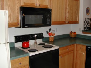
Here is the before picture.

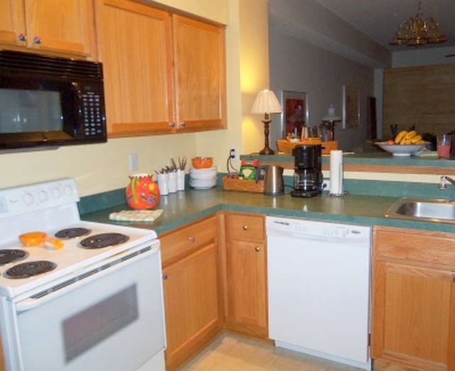
Last year we replaced our stove with a new for us/used one. I painted the backsplash area a soft yellow. DH also installed a track-light fixture with 7 movable lights on a dimmer switch (worth every penny) for direct over-counter, sink and cabinet lighting.

So that leaves the following:

1. paint the back wall

2. visually use the dark green counter tops

3. use vertical wall space.

I’m all for painting ONE wall in a room. It provides the color lift I need, without painting an entire room. Plus, I like the warm white and soft yellow walls we currently have. The back wall of the kitchen has been painted a few times over the years. I can easily paint it in only one hour with just a quart of paint.

So today I am spending my afternoon wielding “weapons of mass destruction” including a power drill, hammer, screwdriver and tape measure.

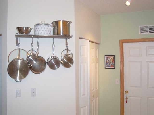
After picking up a Grundtal shelf at IKEA, 2 trips by me and 1 trip by DH to the hardware store for the correct screws and anchors, the shelf was finally attached to the wall.

This made me stop and think how difficult all of this would be for someone who didn’t own a car or who relied on public transportation. It’s quite a drive to the hardware store and a lot of gas is used each trip – even if I try to consolidate trips. Those in poverty don’t easily have the luxury of doing even simple things to make their homes more efficient or their lives easier. Something we deem as simple as doing the laundry or grocery shopping can be an arduous proposition if you are taking the bus or walking. Then imagine having small children with you!

In the end my kitchen update cost me a quart of paint from Sears ($10), shelf ($15), hardware ($5), track-light fixture ($98), bright orange rug ($13) for a total cost of $141.

I don’t have a before picture but the back kitchen wall was previously painted a dark orange color. It is now a light sage green color that visually relates to the green counter. I like the final results. It looks fresh. The shelf makes using the pots & pans so much easier, opens up cabinets and uses wasted vertical space.

Photo R. Meshar

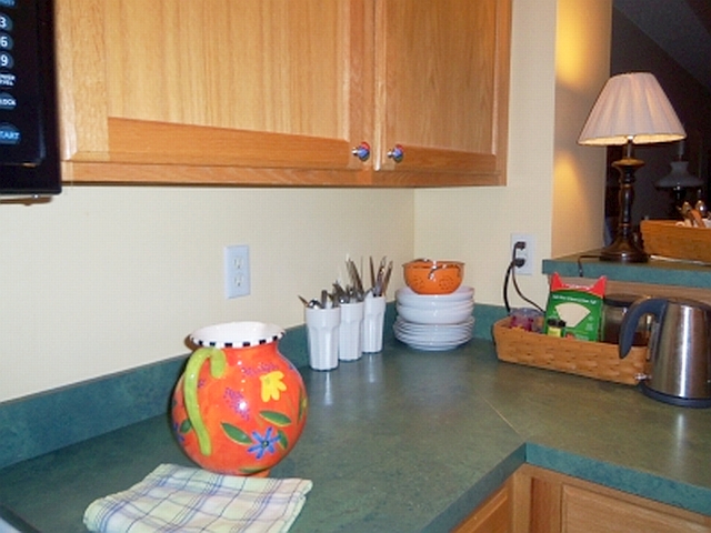
The counter area was revamped too. I made use of the dead corner space for stacking white low bowls. We use these to eliminate a myriad of other plates, salad plates and soup bowls. These white porcelain bowls actually look good with the green counter tops. Three glasses hold cutlery. This is not only convenient, it puts unused counter space to work. Everything stored on the counters are items we use daily.

Photo R. Meshar
Photo R. Meshar

That finishes the kitchen update. I like the look. It isn’t sterile. The baskets organize coffee & tea supplies and add texture. Hanging shiny pans add a little bling. A small lamp on the snack bar, along with overhead track lighting warms the space. We do cook together easily in this kitchen. It works for us.

Welcome to our kitchen –

Photo R. Meshar

The front entry area will be the next to see a little attention. Watch for changes coming soon.

You may also like Simplifying Our Kitchen, Simplify, Simplify, Simplify, and Isn’t It Romantic?

Romantic Living Room Before & After

You may remember that in adding romance to my life this year I decided to add some to our living space. I started with the bedroom and bathroom. The dining area followed. Now the living room.

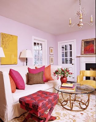
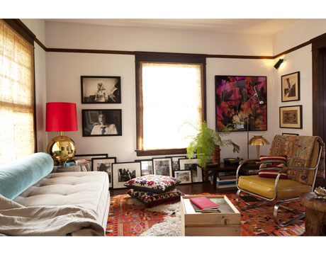
You can see the inspiration ideas from a previous post here. Below is an inspiration picture that I liked for its energy, lightness and fun colors.


Photo Angie Hranowsky

Our space needed to lighten up. I wanted joyful color with plenty of white and a summery feel. My desire was to add more layers, with space for books, candles, plants and space to entertain. The futon would remain, as it serves double-duty as a guest bed. Plus the space needed to be compatible with adjoining dining area and kitchen spaces since those are being re-done as well.

Whatever was done would need to flow with the rest of the townhouse. Colors shouldn’t be jarring with the bedroom and bathroom. And of course it shouldn’t cost much. I prefer to donate money rather than spend it on decorating. But economics shouldn’t prohibit creating a beautiful space with light, energy, warmth, casual feel and hospitality. At least it’s never stopped me in the past. 😉

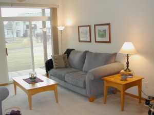
I forgot to take a before picture – but previous colors were red, gold, sage, white with light teal. A sage blanket was on the sofa. A brown runner anchored the sofa and coffee tables. It was OK, but some new energy was needed.

Here’s a picture from three years ago so you can get an idea of the space.

I removed pillows and other accessories. The sofa, now a futon, has since moved to the opposite wall. The coffee table was given to a friend and the two end tables serve as coffee tables. Last summer, book cases from the small bedroom were moved to the wall opposite the sofa (not seen in this photo).

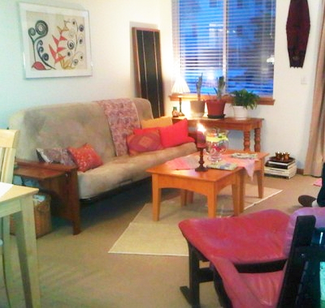
Searching my linen closet, I found the rag rug for the table and an Indian cotton throw for the sofa in similar colors. A new candle and some fun toys (jacks, Silly Putty, Playdough et. al.) in the glass hurricane on the coffee table are just for fun. Next, new cotton rugs were layered under the tables. I purchased four new colorful pillows and pulled one from a bedroom. We found the rose-colored chair and ottoman on Craigslist.

Now the space is totally changed. Before, the artwork seemed to compete with the room. Now the artwork sets the color and tone, supported by the entire room. Candle light adds to the warm, romantic look.

Here’s the more romantic after.

Photo R. Meshar

Now it’s light, bright, relaxed. We enjoyed dinner in here tonight. Easy and comfortable . . .

You may also like Romantic Living Room Inspiration, Romantic Bedroom Before & After, Romantic Dining Area Before & After and Romantic Bathroom Before & After.

2 Mattresses + 1 Bolster = Sofa

Photo House Beautiful

Two twin mattresses (8-10 inch height) covered in painters’ cloth linen and tufted, plus one plump bolster equals one great sofa. It also serves as a bed or even two guest beds.

While the contrasting color for the bolster is a good idea, the bolster should be twice as large in diameter. This way the seating space and back support would create a real seating option.

Creative idea.

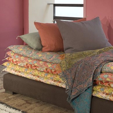
One more sumptuous option from Caravane below. This is definitely a DIY option. Anyone who collects vintage blankets or quilts could fold and stack them quickly and easily on a long coffee table, covered platform or bench of your choice. Wouldn’t you love to take a nap here?

Photo Caravane

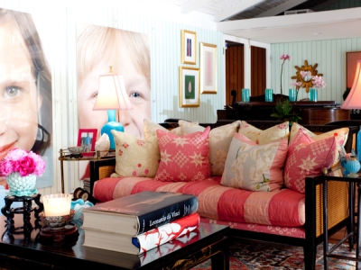
Here’s a fun idea by Hillary Thomas that could be use for a futon or daybed too. It could also re-purpose a quilt or matelassé cover. Add quirky pillows and voila!

Photo HIllaryThomasDesigns

The reason people are so creative with regard to sofa beds is because the furniture industry is deeply asleep. They have yet to figure out how to make an inexpensive, attractive and comfortable sofa bed. Actually they have yet to figure out how to make in expensive, attractive, flexible furniture in general. This is not rocket science, as you can see in the pictures above. It is inertia and complacency. Read more at this post: Our Furniture Moves Around.

You may also like Romantic Bedroom Before & After.

Easy Summer Travel Wardrobe

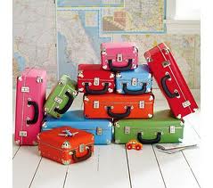
Photo LandOfNod.com

Check out Miss Minimalist’s complete 10-item wardrobe. Yes . . . well I’m not there yet, but it is inspiring.

At a minimum (couldn’t resist) it’s a great travel wardrobe. This summer, don’t check your luggage, travel light.

For myself, I would exchange her dress and skirt for two additional pants. Still, it works.

In fact, when I traveled for an extended period to France and Israel, my wardrobe was this:

3 pairs of slacks (khaki, black and white)

3 long sleeve solid t-shirts

3 tank tops (in compatible solid colors to wear alone or under the T-shirts)

1 lightweight jacket

1 large scarf (to use as a shawl, sarong over the pants or as a furoshiki bag),

2 pairs of shoes: dress sandals, walking shoes

1 swimsuit. Sunglasses. No purse.

These items take up almost no room. They wash and dry easily. You can travel almost endlessly (or for at least 6 weeks as I did) on this wardrobe. It all fits in a small pilot bag and will take you just about anywhere this summer.

Or maybe let it take you on an exploration of the world for 15 years, as Rita Golden Gelman did in Tales of a Female Nomad. Check your library for a copy.

Life is short. Bon voyage!

You may also like Fabulous Furoshiki, The Richness of Simplicity, Simplify, Simplify, Simplify, Antique Bookstores in Paris and Pura Vida!