You may remember that I decided to give the romantic treatment to my kitchen this year (check out Romantic Kitchen Inspiration post) – just as I did with other areas of our home here, here, here and here.
This was my inspiration:
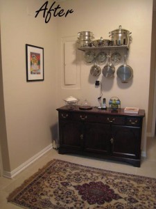
My hope was to add a little sparkle, better lighting, make things we use often more accessible (not having to constantly get cookware from the bottom cupboards for example), make use of wasted space and update the look.
As with other areas in our home, I am not spending money to change out perfectly good counters, sink or cabinets just because they are 10 years old and don’t match styles in new construction. Likewise, our appliances don’t match but they work and so are staying, as is the flooring.
Here is the before picture.
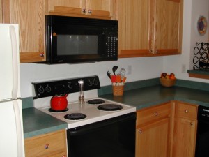 Last year we replaced our stove with a new for us/used one. I painted the backsplash area a soft yellow. DH also installed a track-light fixture with 7 movable lights on a dimmer switch (worth every penny) for direct over-counter, sink and cabinet lighting.
So that leaves the following:
1. paint the back wall
2. visually use the dark green counter tops
3. use vertical wall space.
I’m all for painting ONE wall in a room. It provides the color lift I need, without painting an entire room. Plus, I like the warm white and soft yellow walls we currently have. The back wall of the kitchen has been painted a few times over the years. I can easily paint it in only one hour with just a quart of paint.
So today I am spending my afternoon wielding “weapons of mass destruction” including a power drill, hammer, screwdriver and tape measure.
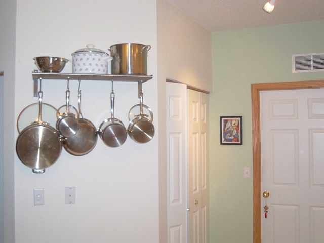
After picking up a Grundtal shelf at IKEA, 2 trips by me and 1 trip by DH to the hardware store for the correct screws and anchors, the shelf was finally attached to the wall.
This made me stop and think how difficult all of this would be for someone who didn’t own a car or who relied on public transportation. It’s quite a drive to the hardware store and a lot of gas is used each trip – even if I try to consolidate trips. Those in poverty don’t easily have the luxury of doing even simple things to make their homes more efficient or their lives easier. Something we deem as simple as doing the laundry or grocery shopping can be an arduous proposition if you are taking the bus or walking. Then imagine having small children with you!
In the end my kitchen update cost me a quart of paint from Sears ($10), shelf ($15), hardware ($5), track-light fixture ($98), bright orange rug ($13) for a total cost of $141.
I don’t have a before picture but the back kitchen wall was previously painted a dark orange color. It is now a light sage green color that visually relates to the green counter. I like the final results. It looks fresh. The shelf makes using the pots & pans so much easier, opens up cabinets and uses wasted vertical space.
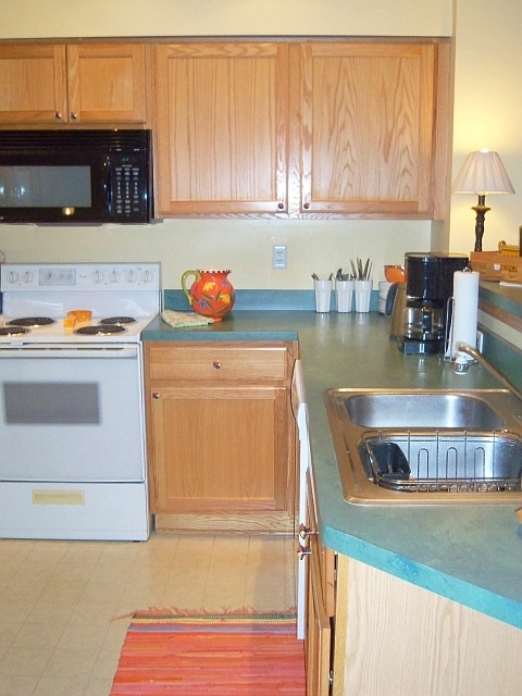
The counter area was revamped too. I made use of the dead corner space for stacking white low bowls. We use these to eliminate a myriad of other plates, salad plates and soup bowls. These white porcelain bowls actually look good with the green counter tops. Three glasses hold cutlery. This is not only convenient, it puts unused counter space to work. Everything stored on the counters are items we use daily.
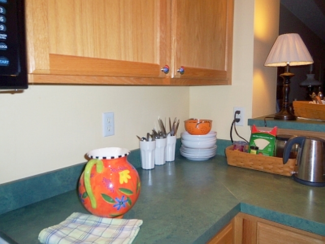
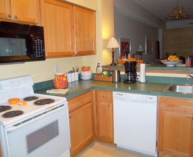
That finishes the kitchen update. I like the look. It isn’t sterile. The baskets organize coffee & tea supplies and add texture. Hanging shiny pans add a little bling. A small lamp on the snack bar, along with overhead track lighting warms the space. We do cook together easily in this kitchen. It works for us.
Welcome to our kitchen –
The front entry area will be the next to see a little attention. Watch for changes coming soon.
You may also like Simplifying Our Kitchen, Simplify, Simplify, Simplify, and Isn’t It Romantic?